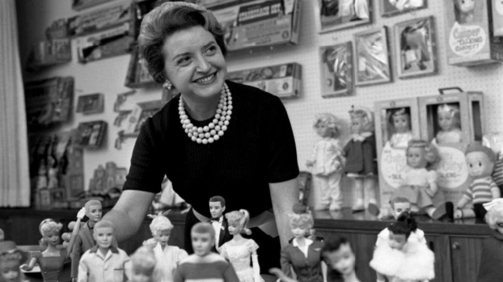
Let’s take a walk down memory lane and explore the fascinating evolution of the Barbie logo. Over its impressive 63-year lifespan, the Barbie logo has experienced several redesigns, but the first logo introduced in 1959 remains the most successful and largely unchanged. From the distinctive cursive wordmark with its iconic capital “B” to variations like the Barbie head logo and the black Barbie logo, this logo’s history showcases the power of maintaining a recognizable design. The Barbie logo’s predominantly pink color reflects its target audience of girls and women, while its unique fonts closely resemble those used throughout the brand’s journey. Created by Ruth Handler and inspired by her daughter’s love for adult paper dolls, Barbie has not only endured controversy and legal disputes but has also become an influential and enduring toy brand.
The First Barbie Logo
Introduction of the Barbie logo in 1959
In 1959, the first Barbie logo was introduced alongside the launch of the iconic Barbie doll. This logo marked the beginning of a global phenomenon that would span over six decades. The Barbie logo, with its distinctive cursive wordmark, became synonymous with the brand and played a crucial role in establishing Barbie as an instantly recognizable toy.
Largely unchanged design
Since its inception, the Barbie logo has remained largely unchanged. The original design was a testament to its success, capturing the essence of the brand and appealing to millions of girls and women worldwide. Despite various logo redesigns over the years, the core elements of the Barbie logo, such as the cursive font and the iconic capital ‘B,’ have persevered, creating a sense of continuity and familiarity.
Influences from German Bild Lilli dolls
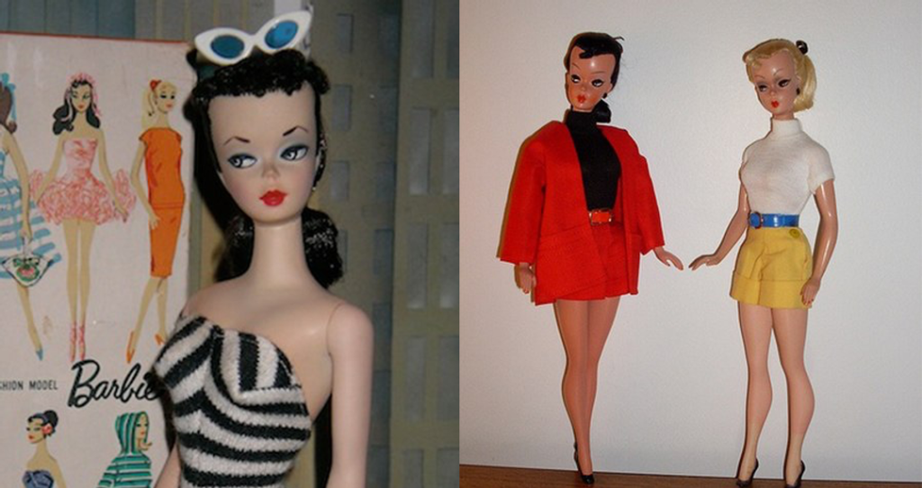
The design of the first Barbie logo was heavily influenced by the German Bild Lilli dolls. Ruth Handler, the founder of Barbie, drew inspiration from these dolls, which were popular in Germany during the 1950s. The Bild Lilli dolls featured similar characteristics, such as elegant fashion choices and a confident demeanor, which served as the foundation for Barbie’s brand identity.
Naming after the founder’s daughter, Barbara Handler
One notable aspect of the first Barbie logo is the naming behind it. Barbie was named after Ruth Handler’s daughter, Barbara Handler. By incorporating her daughter’s name into the logo, Ruth not only paid homage to Barbara but also personalized the brand. This personal touch added an extra layer of authenticity and served to forge a strong emotional connection between the doll and its target audience.
Unique Logo Variations
Barbie head logo
Apart from the primary Barbie logo, various unique logo variations have been created over the years. One such variation is the Barbie head logo, which prominently features the profile of Barbie’s face. This logo often appears on merchandise and serves as a symbol of the brand’s identity. The Barbie head logo has become recognizable to both children and adults, embodying the playful and aspirational qualities associated with the Barbie brand.
Black Barbie logo
In recent years, the Barbie brand introduced a distinct logo variant, known as the black Barbie logo. This logo was specifically designed to celebrate diversity and inclusivity, reflecting the brand’s commitment to representing different racial and ethnic backgrounds. The black Barbie logo features a silhouette of a black Barbie doll, symbolizing empowerment and cultural representation.
Different uses on various mediums and backgrounds
The Barbie logo’s flexibility is evident in its different uses on various mediums and backgrounds. Whether it’s on packaging, advertisements, or online platforms, the logo seamlessly adapts to different contexts while maintaining its iconic identity. The Barbie logo’s versatility allows it to reach a global audience, transcending cultural and linguistic barriers.

This image is property of logo.com.
The Barbie Logo Design
Absence of an official font
Despite its widespread recognition, the Barbie logo does not have an official font associated with it. This absence of a designated font allows for more creative freedom and adaptability in its application, enabling the logo to take on different styles and variations while retaining its core characteristics.
Resemblance to certain fonts
While there is no official font for the Barbie logo, several fonts closely resemble its style. Fonts like “Barbie Medium,” “Barbie Sparkle,” and “Barbie Script” have been created by individuals and design enthusiasts to imitate the cursive, whimsical nature of the Barbie logo. These fonts allow individuals to incorporate the Barbie aesthetic into their own projects and designs.
Characteristics of the cursive wordmark
The cursive wordmark of the Barbie logo is one of its most defining characteristics. The flowing, feminine script conveys a sense of elegance, sophistication, and playfulness, aligning perfectly with the brand’s core values. The cursive wordmark captures the essence of Barbie as a fashion-forward and aspirational icon, resonating with girls and women of all ages.
Distinctive capital ‘B’
Within the Barbie logo, the capital ‘B’ stands out as a distinctive element. Its unique and exaggerated loop adds a touch of personality and visually separates the brand name from the rest of the wordmark. The capital ‘B’ has become synonymous with Barbie, serving as a recognizable symbol and reinforcing the brand’s identity.
Evolution of the Barbie Logo
Redesigns throughout 63 years
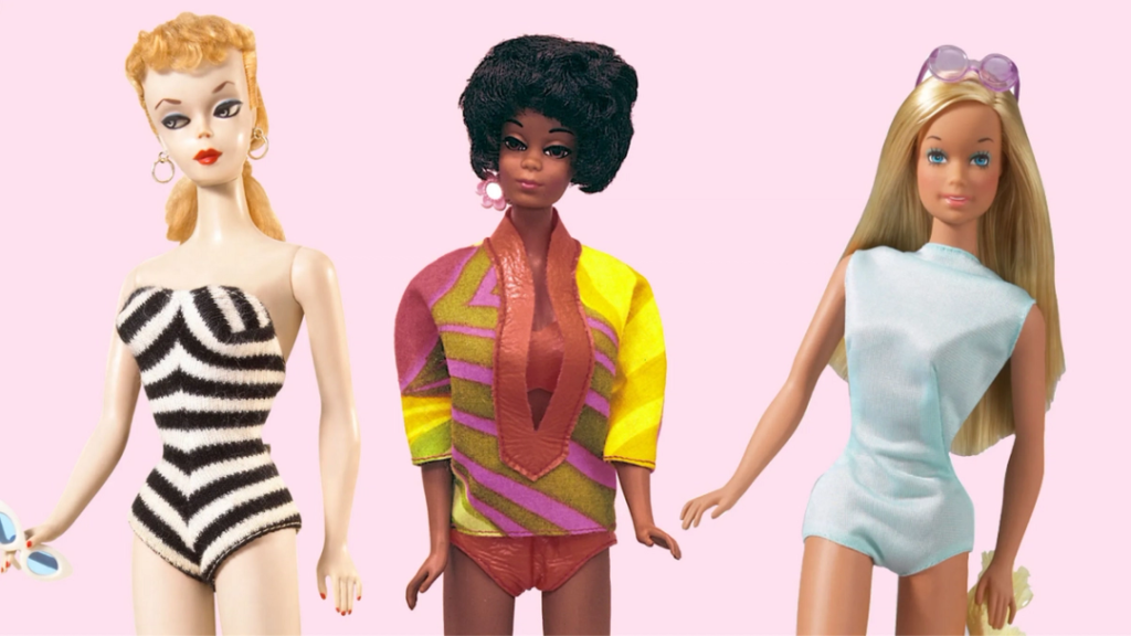
Throughout its 63-year lifespan, the Barbie logo has undergone several redesigns to keep up with the changing times and trends. These redesigns aimed to refresh the brand’s image while maintaining its core essence. From subtle adjustments to more significant updates, each logo evolution reflected the brand’s commitment to staying relevant and appealing to a new generation of Barbie enthusiasts.
Importance of maintaining recognizable design
Despite the logo’s evolution, it has been crucial for the Barbie brand to maintain a recognizable design. By preserving key elements such as the cursive font and the distinctive capital ‘B,’ the logo ensures a sense of continuity and familiarity for consumers. The Barbie logo’s recognizable design acts as a visual anchor, creating a strong association with the brand’s values and heritage.
Brand success through consistent logo design
The consistent design of the Barbie logo has played a significant role in the brand’s success over the years. By maintaining a cohesive visual identity, the Barbie logo has become an enduring symbol of quality, innovation, and empowerment. Its recognizable design has helped Barbie maintain its position as a global powerhouse in the toy industry, capturing the hearts and imaginations of millions of people worldwide.

This image is property of logo.com.
The Pink and Feminine Identity
Pink as the predominant color choice
Throughout its evolution, the Barbie logo has predominantly featured the color pink. Pink is often associated with femininity, and its use in the Barbie logo reinforces the brand’s identity as a celebration of girlhood and womanhood. The color choice also aligns with Barbie’s core message of self-expression and individuality, allowing girls to embrace their own unique personalities.
Representation of the brand’s target audience
The pink color palette in the Barbie logo serves as a visual representation of the brand’s target audience – girls and women. By incorporating pink into its logo and overall branding, Barbie aims to create an emotional connection with its consumers. The feminine identity projected by the logo resonates with its target audience, fostering a sense of belonging and empowerment.
Appeal to girls and women
The pink and feminine identity portrayed in the Barbie logo appeals not only to young girls but also to women. The logo’s design and color choices evoke nostalgia, reminding adult women of their own Barbie experiences and encouraging them to pass on the legacy to the next generation. The appeal to both girls and women has contributed to the enduring popularity and cultural significance of the Barbie brand.
Controversies and Legal Disputes
Resemblance to the German Bild Lilli doll
The Barbie brand has faced controversies and legal disputes over the years, mainly due to its resemblance to the German Bild Lilli doll. The Bild Lilli doll, created in the 1950s, shares many similarities with Barbie, including its fashion choices, body proportions, and overall concept. These similarities have sparked debates and criticisms regarding cultural appropriation and the originality of the Barbie brand.
Controversies surrounding the Barbie brand
In addition to the controversies surrounding its resemblance to the Bild Lilli doll, the Barbie brand has faced criticism for its portrayal of unrealistic body standards and gender stereotypes. The doll’s proportions and emphasis on beauty and fashion have sparked debates about body image and the potential impact on young girls’ self-esteem. However, the Barbie logo itself has largely remained separate from these controversies.
Legal issues faced by Barbie
The Barbie brand has also encountered legal issues related to copyright and intellectual property. Various lawsuits have been filed over the years, challenging the brand’s ownership of certain designs and elements, including the Barbie logo itself. Despite these legal disputes, Barbie has managed to navigate through the challenges and maintain its status as an iconic and successful toy brand.
Continued success despite controversies
Despite the controversies and legal disputes, the Barbie brand has continued to thrive and remain a beloved and iconic brand. The enduring popularity of Barbie speaks to the intrinsic qualities that the brand represents – imagination, creativity, and empowerment. The Barbie logo, with its strong visual identity, has helped Barbie withstand these challenges and emerge as a symbol of resilience and cultural significance.

This image is property of logo.com.
The Barbie Head Logo
Description and significance of the Barbie head logo
The Barbie head logo is a unique variation of the original Barbie logo, featuring a stylized profile of Barbie’s face. This logo has gained widespread recognition and serves as a visual shorthand for the Barbie brand. The Barbie head logo encapsulates the essence of the doll itself, symbolizing beauty, fashion, and aspiration.
Use and application on various merchandise
The Barbie head logo is frequently used on a wide range of merchandise, including clothing, accessories, and packaging. Its application on merchandise reinforces the brand’s identity and ensures consistent branding across different products. The Barbie head logo acts as a stamp of quality, guaranteeing consumers that they are purchasing genuine Barbie merchandise.
Recognition and association with the Barbie brand
The Barbie head logo is instantly recognizable, evoking a sense of familiarity and nostalgia. Its association with the Barbie brand is deeply ingrained in popular culture and has been celebrated in movies, TV shows, and iconic advertising campaigns. The logo’s distinct silhouette has become an iconic symbol of the Barbie brand, transcending generations and geographic boundaries.
The Black Barbie Logo
Description and significance of the black Barbie logo
The black Barbie logo is a notable variation that was introduced to celebrate diversity and inclusivity. This logo prominently features the silhouette of a black Barbie doll, symbolizing representation and empowerment. The black Barbie logo holds significant cultural importance, reinforcing the brand’s dedication to inclusivity and reflecting the diversity of Barbie’s consumer base.
Purpose and representation
The purpose of the black Barbie logo is to acknowledge and celebrate the diversity of individuals who play with Barbie dolls. By prominently featuring a black Barbie doll in the logo, the brand demonstrates its commitment to embracing and representing different racial and ethnic backgrounds. The black Barbie logo highlights the importance of inclusive play and aims to inspire all children to believe in their own potential.
Different uses and adaptations
Similar to the original Barbie logo, the black Barbie logo has been adapted for use on various mediums and platforms. It appears on packaging, advertisements, and online content, ensuring that the representation and inclusivity it symbolizes are present across all facets of the brand. The black Barbie logo’s versatility allows it to resonate with a wide audience and foster a sense of belonging.

This image is property of logo.com.
Consistency and Adaptability
Balancing consistency and adaptation in logo design
The Barbie logo’s evolution over the years showcases the delicate balance between consistency and adaptation. While it remains true to its core elements, such as the cursive font and the distinctive capital ‘B,’ the logo has undergone redesigns to stay relevant and appeal to new generations of consumers. By striking the right balance, Barbie has successfully maintained its brand identity while remaining adaptable to changing market demands.
Barbie logo’s ability to evolve while maintaining brand recognition
One of the key strengths of the Barbie logo is its ability to evolve without compromising brand recognition. Through careful design choices and strategic updates, the logo has managed to stay true to its roots while embracing modern design trends. This adaptability has allowed the Barbie logo to remain fresh and exciting while maintaining a strong connection to its audience throughout its extensive history.
Future of the Barbie Logo
Speculations and predictions on future logo changes
As trends and consumer preferences continue to evolve, it is natural to speculate on the future changes the Barbie logo may undergo. Some predictions include a greater emphasis on digital design elements, such as animation and interactivity, to engage tech-savvy audiences. Additionally, with the growing focus on sustainability, the Barbie logo may incorporate eco-friendly elements or promote environmentally conscious messaging.
Anticipated trends and considerations
The future of the Barbie logo will likely be influenced by anticipated trends in design and branding. Minimalism, bold typography, and vibrant colors are expected to shape the logo landscape. Considerations such as inclusivity, representation, and social responsibility will likely play a greater role, ensuring that the Barbie logo remains relevant and resonates with diverse audiences.
In conclusion, the Barbie logo has played a crucial role in establishing the Barbie brand’s global icon status. From its introduction in 1959 to the present day, the logo has evolved while maintaining its core essence, symbolizing beauty, fashion, and empowerment. The Barbie logo’s adaptability, recognition, and association with the brand have contributed to its enduring success and cultural significance. Looking ahead, the future of the Barbie logo will continue to embrace trends and considerations that align with the brand’s values and cater to a diverse and ever-changing audience.

This image is property of logo.com.


